There may not be 50 shades of Italian colours but there are more than you might think. Carol King reports on some of the colours that have a very special Italian hue.
Celeste - Italian Sky Blue
Italian sky blue refers to a pale turquoise blue colour that is associated with the Italian bicycle company Bianchi. It is also sometimes called celeste Bianchi or Bianchi green, and is one of the celeste (sky blue) colours that attempt to emulate the colour of a clear sky. Bianchi bicycles are traditionally painted Italian sky blue. Edoardo Bianchi founded the bicycle company in Milan in 1885 and some say the colour emerged because it is meant to reproduce the colour of the Milan sky. However, others have suggested that Edoardo chose the colour to match the eyes of a former queen of Italy for whom made a bicycle. However, it seems most likely Edoardo created the colour using surplus military paint from World War I that he mixed with white to tone down its militaristic connotation. 
Rosa Schiaparelli - Schiaparelli Pink
Schiaparelli pink is a shocking pink colour more akin to magenta than pink. It is named after the Italian fashion designer Elsa Schiaparelli. She introduced the colour in 1936, using it for the packaging of her perfume Shocking which was contained in a bottle sculpted by Leonor Fini in the shape of a woman's torso inspired by Mae West's tailor's dummy and Dalí paintings of flower-sellers. The packaging, also designed by Fini, was in shocking pink, which became Schiaparelli's signature colour. This in turn was inspired by the Tête de Belier (Ram's Head), a 17.27ct pink diamond from Cartier owned by heiress Daisy Fellowes, who was one of Schiaparelli's best clients. 
Verde Veronese - Paolo Veronese Green
Paolo Veronese green is an intense dark shade of green. It is named after the 16th-century Venetian painter Paolo Veronese. You can see Paolo Veronese green in the artist’s painting ‘Lucretia’ of
1583 that depicts the mythical figure of Roman history whose rape by the Etruscan king’s son and her subsequent suicide are said to have lead to the foundation of the Roman Republic. The painting hangs in
Vienna’s Kunsthistorisches Museum and shows Lucretia wearing a striking green skirt. However, according to experts, the painter did not invent the colour named after him. It existed in the 14th century and came about via a painting technique employed by Veronese and other Venetian painters of that time. 
Terra di Siena - Sienna
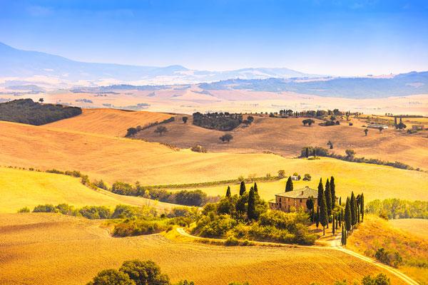
Sienna takes its name from terra di Siena, or earth of Siena. The yellow-brown colour refers to a pigment named after the Tuscan city where it was used by artists during the Renaissance. When heated the pigment becomes a reddish brown and is referred to as burnt sienna. The pigment was one of the first ever to be used by humans, and appears in cave paintings and Ancient Roman frescoes. It became popular during the Renaissance when the clay soil of Tuscany, which is rich in sienna’s main ingredient limonite, was used to produce the pigment. Then, the pigment was referred to as terra di Siena, terra rossa (red earth) or terra gialla (yellow earth). Italian art historian Giorgio Vasari called it terra rossa in his pioneering work of 1550 ‘The Lives of the Most Excellent Italian Painters, Sculptors, and Architects, from Cimabue to Our Times’. The brown pigment was in common use in the 16th century by artists including Caravaggio and Rembrandt. In contemporary times, the sienna pigment is produced largely in Sardinia, Sicily, the French Ardennes and the Appalachian Mountains in North America. 
Giallo Napoli - Naples Yellow
Naples yellow is sometimes known as antimony yellow. The words are used to describe a range of yellow from an earthy, reddish yellow to a bright light yellow. It refers to the chemical compound, lead (II) antimonite that was used as a synthetic pigment from the early 17th century. Naples yellow was adopted by the Old Masters and was identified as a colour in the English language in the 18th century. However, today, the pigment is rarely used by artists and paint labelled ‘Naples yellow’ is likely to have been made from a mix of less toxic pigments. 
Rosso Pompei - Pompeiian Red
Pompeiian red is a red ochre colour used to describe a pigment made from iron oxide. In Ancient Rome, it was known as sinopsis after the city of Sinope where, according to Pliny, it was discovered. Pompeiian red was used in murals in Ancient Roman cities, including Pompeii, which is how it got its name. It is sometimes called Ercolano red, although strictly speaking, Ercolano red is a red ochre obtained in the vicinity of Ercolano, which was known as Herculaneum in Roman times. In ancient times, Pompeiian red was prepared using pieces of cinnabar, which was very costly, ensuring that it was used for decoration in the wealthiest homes. Because cinnabar contains mercury, later the colour was produced using mixtures of iron oxides and hydroxides. Pompeiian red was used to decorate the 'case cantoniere' (road inspectors’ houses) that line roads and highways throughout Italy. The red and white buildings have signs showing on the side giving a number in kilometers and the 'strada statale' (trunk road) number. The buildings were used to store signal boxes and equipment used to carry out road maintenance and were used by the road inspectors and workers. The buildings were costly to upkeep and most fell into disuse in the 1980s. However, the Pompeiian red buildings are still populous, particularly in southern Italy. 
Rosso Valentino - Valentino Red
Known to fashionistas worldwide, Valentino red is a primary red with notes of deep orange that add impact and intensify tone. Italian fashion designer Valentino Garavani used a poppy-red colour for a dress in his first collection. It became his signature colour, which he returned to regularly throughout his career, ending his haute couture shows with a procession of models wearing flaming-red evening gowns. He developed his passion for red as a young man when he went to Barcelona in Spain, where he saw an opera in which all the costumes were red. Valentino told ‘The Sunday Times’ newspaper in 2012: “It was at that moment I realised that, after black and white, there is no colour more beautiful or flattering to women than red.” Many women believed him, and Hollywood stars, jet setters and royalty have all been seen in Valentino red couture dresses. The distinctive red has become so associated with the designer that it has become known as ‘Valentino red’ in the fashion world and beyond. 
Rosso Ferrari - Ferrari Red
Ferrari red is more properly known as ‘rosso corsa’ (racing red) and refers to the brilliant red colour adopted by Italian international motor-racing cars, in the same way British cars sport British racing green and French cars use bleu de France (blue of France). Italy adopted the red colour for its racing cars in 1907 after an Italian aristocrat, Prince Scipione Borghese, won a race from Peking (now Beijing) to Paris that year. The prince was so sure that he would win the rally that he took a detour from Moscow to St. Petersburg for a dinner in honour of his team. He then returned to Moscow to rejoin the race. Italy adopted the red colour of his Italo car’s livery in his honour. In modern Formula One racing, national colours have been largely replaced by those used by commercial sponsors. However, Italian car manufacturer Ferrari continues to use the traditional red colour that resembles a deep crimson. 
Rosso Veneziano - Venetian Red
Venetian red is a warm red colour with cold red undertones and the name of a pigment made from a natural earth containing clay tinted by ferric oxide. The colour is so called because artists used the pigment mined from a quarry near Venice and the description came into use in English in the mid 1700s. The pigment appears in various forms all over the globe and the ochre has been used since prehistoric times. Today, artists still use Venetian red obtained from iron ore deposits in the Veneto region. 
Rosso Tiziano - Titian Red
Titian red is a reddish-gold colour. It gained its name from the brownish-orange colour seen on women’s hair in many of the paintings of the Italian artist, Tiziano Vecelli, known as Titian in English. Titian was the most important painter of the 16th-century Venetian school. The phrase is generally used to describe hair colour that is slightly lighter than auburn. 


